10 ways to bring calming green into your home
johnlewis.com
We look at creative ways to introduce shades of gorgeous green into each area of your living space
Symbolising nature and new life, green is a powerful colour that has been celebrated for decades, centuries, even. Inspired by the current trend for biophilic design in interiors and our desire to connect with nature – even indoors – green is being used in exciting new ways, with the most on-trend shades inspired by natural materials, such as olive, emerald, jade, forest, pistachio and sage.
Depending on the shade you choose, green can be moody and dramatic or soft and soothing, and has a chameleon-like ability to look both heritage or contemporary in various settings or paired with different accessories.
limelace.co.uk
Make a statement in your hallway
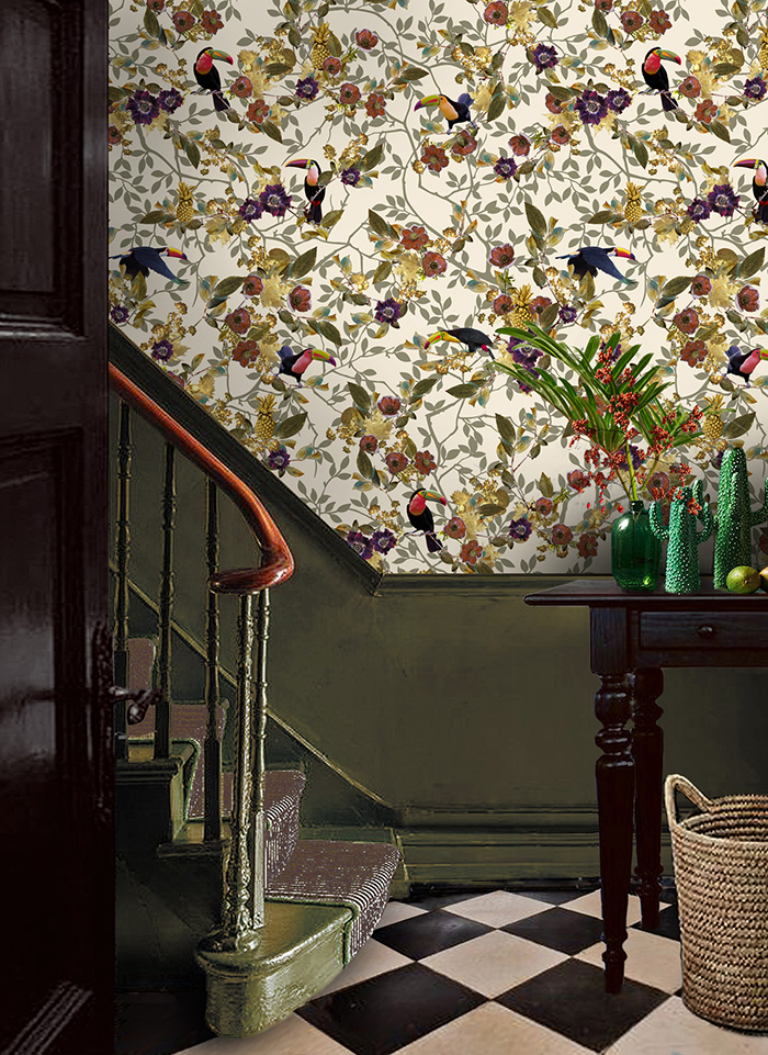
Using green in your hallway makes a style statement from the moment you step into your home. The size of your hallway and the amount of natural light may determine the shade you use. Rich hues of green work well on traditional panelling, pairing with crisp white walls above or a coordinating statement wallpaper, while paler shades will bring a lighter, fresh look to a smaller hallway. If your wooden staircase needs a refurb, consider olive for a hard-wearing darker shade that looks incredibly elegant. It works well with a reclaimed wooden floor, as well as monochrome floor tiles.
johnlewis.com
Go green in the kitchen
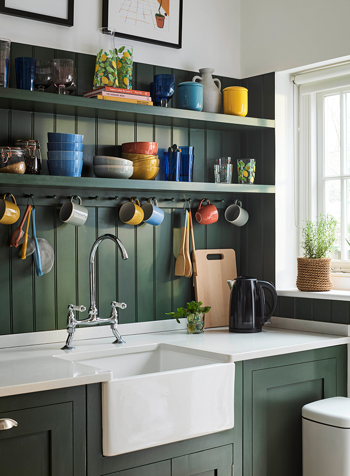
Green has become a new ‘bold’ neutral that works equally well in both contemporary and traditional kitchens. Consider the soft, organic look of light sage – which pairs beautifully with rustic oak flooring or grey flagstones, and oak worktops – to fun shades of zingy lime or retro mint. A matt finish tends to work best, and for a dramatic contrast consider using white marble for worktops and clean white walls.
While darker greens do pair well with dark wood, using lighter beech or oak, or rattan pieces, lifts the look if you don’t want to go too heritage. Darker greens can look flat, so carefully choose lighting and introduce a touch of contrasting shimmer through metallics, glass or metal light fittings, and some gloss finishes such as tiles.
mindtheg.com
Hang botanical prints
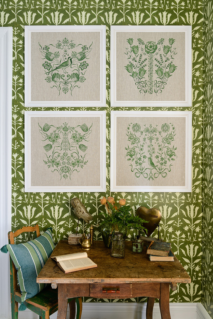
For a touch of leafiness without the dominance of statement wallpaper or the maintenance of real plants, a gallery wall of botanical or tropical prints strikes a happy balance. It’s a feature that also layers well with a statement wallpaper and real plants, if you want to create even more impact. There are many options for your choice of prints, from sections of designer wallpaper to contemporary prints, reprints of vintage designs, or original antique botanical drawings for a more delicate look.
dobbies.com
Add plants to the bathroom
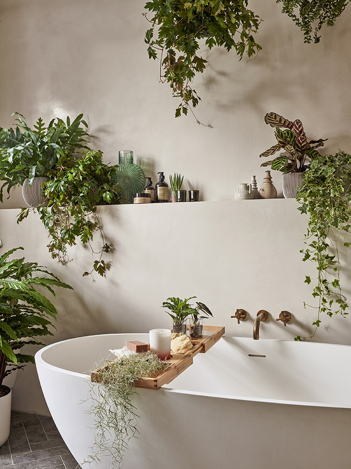
In a room that often has little space to spare for accessories, using foliage can soften the clinical whiteness of sanitaryware and hard, shiny surfaces. In the occasionally humid and typically lower-light conditions of bathrooms, it’s important to pick plants carefully. In a larger bathroom, try growing a showy feature plant, such as bamboo or a weeping fig. Varieties such as the snake plant (Sansevieria trifasciata, or mother-in-law’s tongue) and pothos (Epipremnum aureum) are low maintenance and tolerant, while many types of ferns will enjoy bathroom conditions, and trailing philodendron is great for hanging planters or high shelves.
hattielloyd.com
Refresh your dining room
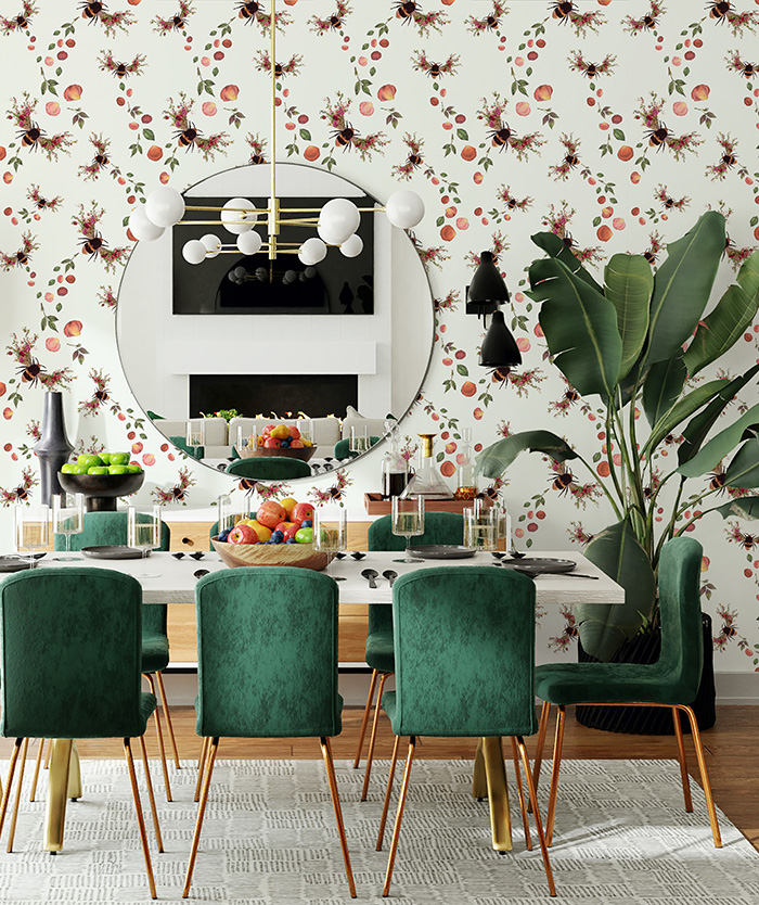
Green can be a breath of fresh air in a dining room. Shades that might not work so well elsewhere can look gorgeous here. Chartreuse with its hint of yellow is ideal for accessories in a cottage-style dining room, pairing well with neutrals such as cream and beige, and rustic wood flooring. For a more formal look, emerald is a natural partner for an elegant antique dining table in rosewood or mahogany, and the look can be lifted with a shimmering chandelier and mirrors.
For a fun contemporary vibe, use a statement feature such as retro lime-green chairs in a monochrome black-and-white scheme, or velvet chairs in a rich green shade with a simple table, statement wallpaper and a bold chandelier for an impactful look.
dobbies.com
Try vertical planting
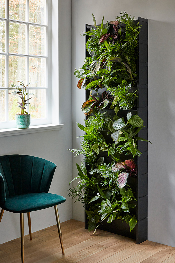
Growing upwards has become a big trend in both gardening and interiors, offering a stylish solution for planting where space is limited, such as in a small courtyard garden or inside an apartment, although it can be used as a feature in any space. Create a living wall by simply attaching or hanging pots or troughs on to a vertical wooden or metal frame. Serious vertical growers may prefer a purpose-built hydroponic system in which plants are grown without soil.
wallsauce.com
Opt for tropical wallpaper
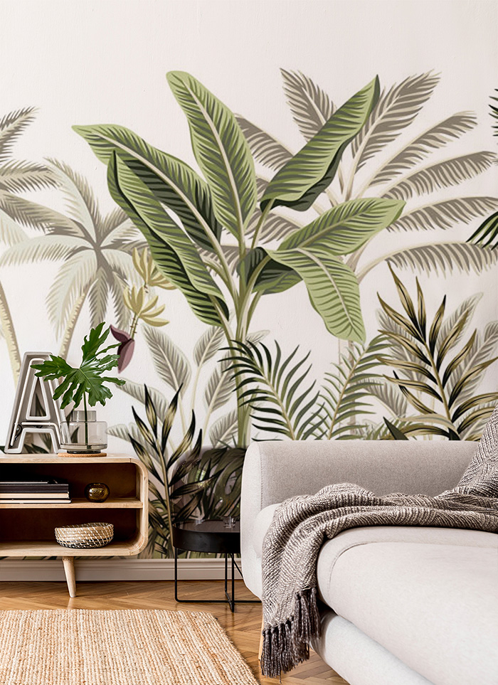
While tropical wallpaper designs can seem a little ‘extra’, people love how these prints bring a touch of exuberance and lushness all year round. Many designers say the smallest spaces are the best places to go big and bold, so try a statement print in a cloakroom, bathroom, study or playroom. The island paradise look can also create a restful bedroom or living room, especially if you stick to a single colour print. In some spaces, a mural can work better than a busy repeating print. Look for one that feels more like a painting, with a neutral background or some breathing space in the design, which will feel more restful.
pigletinbed.com
Make a serene bedroom
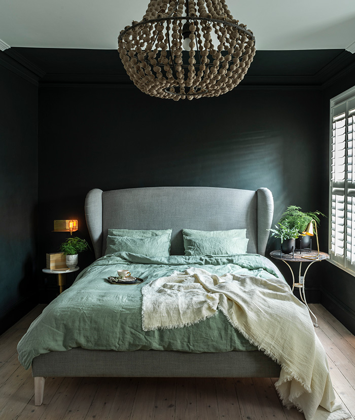
With green considered to be a soothing colour that’s known to reduce stress on a physiological level, while also being invigorating for the senses, it’s an ideal choice for a bedroom, where you go to rest at night, but also want to feel energised in the morning. Mixing green with accent colours creates a more relaxing ambience, with sage teaming up beautifully with blush pink for a softer, feminine look; jade and mustard for a cool retro palette; or try bold jewel tones for a touch of boudoir chic – peacock-inspired shades of emerald green, sapphire blue and teal look glamorous with a hint of gold or burnished brass in the mix.
With soft furnishings often the focal feature in a bedroom, it’s possible to ease gently into a green scheme by introducing cushions, throws, bed linen and window dressings in green, pairing with neutral furniture and wall colours.
johnlewis.com
Create a calming canvas
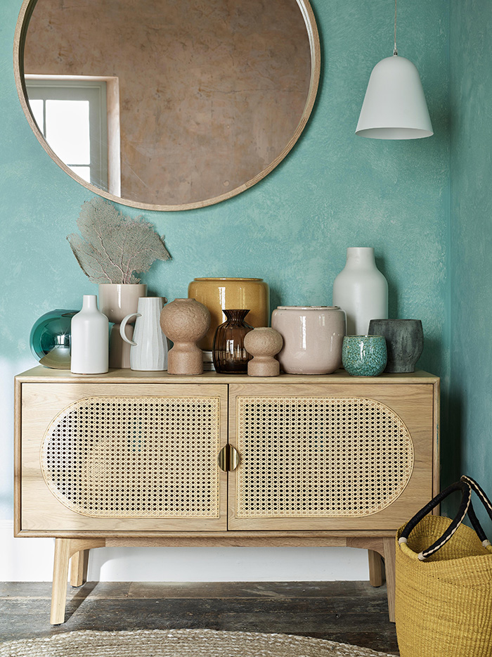
While neutral shades of grey or beige are often seen as the most calming, try harnessing the soothing, nurturing powers of paler green shades to create a harmonious backdrop to highlight a collection, a piece of artwork or a special item of furniture, or even to create a calm space to read, meditate or practise yoga. The right shade of green can look almost neutral in this context, is less clinical than white and warmer than grey. This might mean painting a wall, but could also work as a colour for upcycling a piece of furniture such as a wooden sideboard, shelves or dresser. And as well as using the colour green, go ‘green’ with your product choice: using eco-friendly paint such as earthborn paint as a way to ensure that your green room is also sustainable.
littlegreene.com
Add extra green to the garden
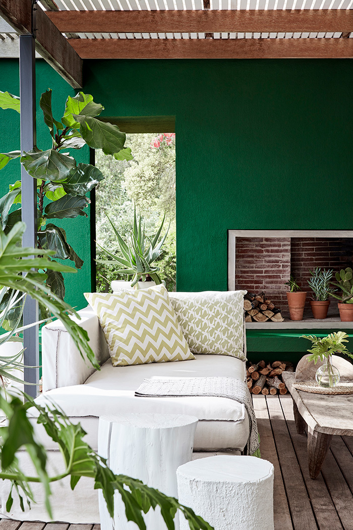
While shades of aquamarine and light sage have been fashionable for upcycling posh sheds, using stronger shades to add character to outdoor seating areas is a great way to imbue a real sense of freshness to the space and make a connection between indoors and outdoors. A rich forest green or slightly lighter jade is a gorgeous backdrop for foliage and flowers, intensifying the lush look and ensuring your patio area looks evergreen all year round. Accents such as vintage terracotta pots and a black-framed gazebo or trellis for climbing plants bring the look together.
WORDS: LINDSEY HARRAD
Before you go...
...fancy automatic entry to all future competitions?
Simply register online today for FREE and you will get:
Automatic entry to all current and future competitions.
Access to Reclaim Inspiration - an online visual pinboard for saving all your home and style inspiration.
A regular newsletter of inspiration, ideas and advice.

Save all your articles in one place
Become a Reclaim Member to save all your home and style inspiration. Simply login or register online today for FREE and you will get:
Automatic entry to all current and future competitions.
Access to Reclaim Inspiration - an online visual pinboard for saving all your home and style inspiration.
A regular newsletter of inspiration, ideas and advice.


